
This post's read time: 4 minutes
Dear Friend,
Today I’m thinking about my deployment next Thursday. I am playing with how it will feel – back on the road to some forgotten part of Colorado, into the fields which feed America. We are a hungry nation. Besides the corn and soy on which I will tramp, I’ll be a small integral part of the wind revolution.
Wind generation, by last estimate on energy.gov, has doubled in the last seven years (from 2015 to 2022).
We now source around 3.25% of our electricity from wind. This is compared to 32% from natural gas and 11% from coal. Or, if you’re of a clean energy bent, 2.3% from mighty hydro or a measly 1.4% from solar.
Mighty wind is more than twice as productive as solar, and yet both are mere rounding errors compared to fossil fuels. I guess we aren’t doing very well, are we?
Solar started becoming a phenomenon around 2010, after decades of it resting on the public consciousness. To be clear, this is mostly photovoltaic solar. The EIA does not include passive solar used to heat houses. In 2012, solar produced 4.3 Billion KWH, compared to 140.8 for wind, and 276.2 for hydro. I think this calls for a graph.
A Tale of two graphs…
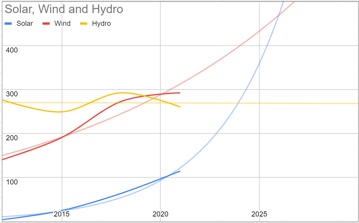
What does the above tell us? Well, first off, it tells me I’d have been better off finding a more detailed data set. EIA does not make it super easy to pull the data out behind their graphs, so I wrote down a few points by hand and then plugged them into google sheets.
More importantly, the first graph makes an important prediction: around 2025 Solar will surpass Wind as the major source of renewable energy in the US. If this comes to pass, or even if the next year or two continue to fit this curve, then we can infer that reality is behaving more like the exponential graph.
This is an important part of analyzing data. You do not force the data to fit your pre-existing prediction, you use it to make a prediction, and then you monitor how well your model does.
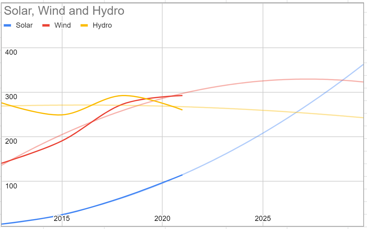
For me, even this tiny bit of data tells us there’s a very good chance of solar outperforming wind in the remainder of this decade – something I would have thought weird before, based on wind’s enormous lead over solar. But let’s look at that second graph, again.

In many ways, this is more realistic. At this point I want to focus on the underlying data (smoothed) – the darker curves. What do you see?
I still see solar surpassing wind in this decade, although closer to the end – maybe 2029.
I see a wavy pattern to Hydro. The trend line shows hydro dropping off over time. We have more data, so let’s see if our wavy pattern holds true when we plot more information. Perhaps our data set was too small to be of any real predictive value?
Hmm. So now our models show either healthy growth if we use the bigger data set or a gentle decline if we use the smaller. I think we don’t have enough information to decide, but based on what I’m told about droughts and climate change, I have a hard time believing the growth model – hydro turbines need water. What do we make of this?
Our biggest take-away ought to be that the noise appears to be greater than the signal. In other words, we do not have enough information to decide. If we had taken the time to measure our uncertainty beforehand, we might have come to the same conclusion. But if anyone tells you they can be confident in one of these models, they’re wrong.
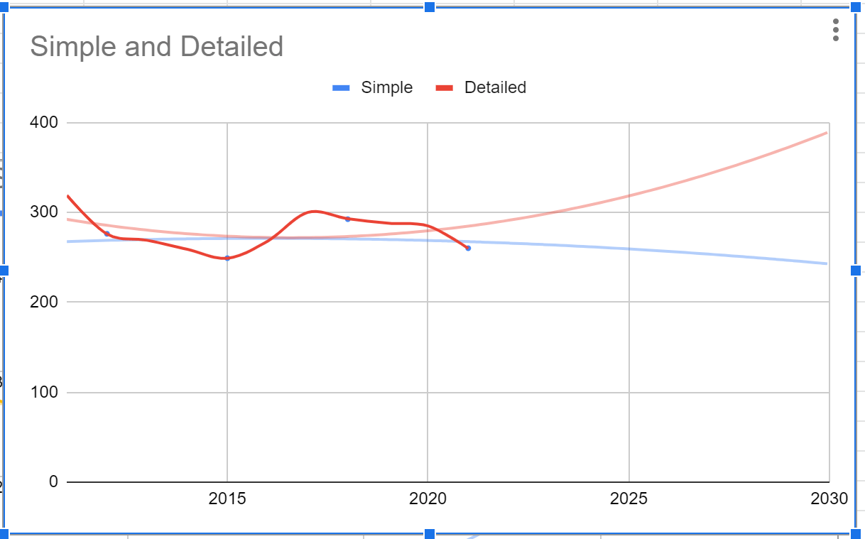
One last thought- What if we add data back to 2008?
Well, now our increased hydro power goes away. Probability tells us the red line above is probably closer to reality than any other. More models have shown a decline, plus reality dictates a decline, and the red line uses the most data yet. But remember – the error to this might be bigger than allows the graph to be useful to us.
Finally, let’s ponder one great consideration: offshore wind. Up to this point it has not been much of a factor, but it will dramatically change the way wind energy works in the US.
So if I were to guess, wind isn’t out of the fight yet. I would predict more of the boom and bust that the graph above shows with wind – periods of slow growth and periods of intense growth – but my guess is wind will still be a bigger player than the data shows. This is a sort of layperson’s Bayesian test – adding a fudge factor for every bit of available knowledge.
For the sake of humanity, I hope the above models are conservative, and that wind and solar surpass coal this year, and surpass coal and natural gas before the end of the decade. I hope someone smart is really looking at the data, not just playing with it, and that the people in charge are listening.
Meanwhile, I’ll go back to packing for Colorado. Temps have been down below zero recently, even though daytime averages for January are typically in the low 50’s.
The town we plan to base out of is named for a guy who, according to Wikipedia, had a “profound effect on the westward expansion of the United States”. Hmm. We’ll leave that one for another time.
I’m hoping I won’t be too worn out from work out there. I have much I’m aching to accomplish: finishing my parts of the Comprehensive Plan for my town, getting momentum behind a sensible plan for affordable housing in our region, studying for the Select Board, and applying to grad school.
I have so many projects here at Inchoate, including getting a wind turbine set up and a heater box for the batteries or insulating the whole workshop.
So I leave you now, to go organize and pack.
Warmly,
Brad